 Chris Krycho
Write! app review
Not too shabby on Windows, not what you want on macOS.
As I’ve noted in the past, I’m always on the lookout for top-notch writing environments. I was recently contacted by the team behind Write! and asked if I would take a look at and review their app, and I was happy to obliged. I tested the app out fairly thoroughly by doing what I normally do with my writing apps: putting together a blog post or the like. I’ve written this review from start to finish in it, across my two Mac machines. I promised the authors an unbiased review, so here we go!
Overview
Write!1 describes itself as a distraction-free text editor. It enters the market in an interesting way: the Mac offerings here are numerous, varied, and excellent. Offerings on Windows are fewer and further between, and in my experience of much lower quality. Distraction-free text editors outside the world of programming text editors barely exist at all on Linux, as far as I can tell.2 Write! is cross-platform, targeting all three of these. And that, as we’ll see, is the story of this particular app—for good and for ill.
The Good
First, the good: the app seems to perform relatively well. Text entry, even on a fairly large document, is smooth and quick. (I imported the text of this ~7200-word paper to test it and it didn’t stutter a bit.) Especially given the time I’m going to spend on the not-so-good below, I want to take a moment to applaud the developers for getting that right. It’s one of the most important aspects of an app like this, and any number of apps I’ve used just fall down on large documents. Everything I’ve seen here makes it seem like Write! would handle much larger documents even than that paper with aplomb.
The app’s main writing area looks fairly nice, and the distraction-free/full-screen mode gets out of the way readily enough. The cloud sync that comes with the app is quick and seems reliable. I’ve worked on this document across the two Macs I use, with no sync issues whatsoever. The writing area also has a (toggleable) overview of the document on the right, a la Sublime Text. To the left is a toggleable outline view, which lets you drill down into the structure of your document if you have multiple heading levels. And within the writing area itself, you can expand and collapse sections demarcated by headings.
In general, the experience of writing in the app is nice. Not amazing, but genuinely nice.
The Just Okay
There’s a bit of a delay before any open tabs are hidden in that fullscreen mode, but it’s otherwise fairly typical of most “distraction-free” writing environments in that regard. The colors chosen for the light and dark writing themes are fine, but not great. Much the same is true of the typography: it’s relatively pleasant, if bland. There are a number of built-in themes, but no apparent way to customize them to be more to your liking.
The app also features built-in autocomplete—but I’m not really sure who the target audience is for auto-complete in this kind of environment. It’s not bad, per se, to have it, but it doesn’t add a lot of value for writing (as opposed to, say, programming), and I turned it off fairly quickly in the process of writing this review.
Publishing
The app includes some “publishing” tools. Currently it supports writing to either Write’s own site, or to Medium. Medium publishing is nice—it’s certainly the hip tool du jour—but you’re out of luck if you use WordPress, much less something like Ghost.3
Publishing to Write! itself seems to be mostly a way of letting people see in-progress drafts. The links aren’t particularly friendly, and while they’d be easy enough to share to Facebook or Twitter or the like, they have serious downsides over any of the free blogging options out there for anything other than getting some early feedback—there’s no organizational or navigational structure available, and for that matter nothing that even ties it to your name! At a minimum, Write! should clarify what this is for.
Business model
The business model here is a curious mix: they’re selling the app at $19.95 (USD), with a year included of their custom sync solution. That sync solution is one of the things they advertise most heavily, and while I can attest that it works well, adding another, bespoke sync solution to my life is not on my list of things I’d like to do. It’s particularly an issue from where I stand because it doesn’t actually get me any benefits over a syncing solution using Dropbox or iCloud, both of which I’ve used extensively with other writing apps in the last few years, with no issues.
Add onto that the fact that the sync and future updates become an annual purchase—
Starting one year after purchase, Cloud access and maintenance updates are $4.95/yr.
—and any of the myriad other editors look much better: they all just use a sync engine I already use and like, and they don’t have annual fees for a service I don’t care about.
That goes double when you consider that I’ll often do different phases of drafting a given post in different editors, depending on the kind of content and what I’m doing with it. For example, I often use Caret for drafting technical blog posts, but at times I’ll switch over to using Sublime Text, Atom, or VS Code for working on the details of a given code snippet. If I’m using Write’s custom sync solution, my documents don’t exist in a normal folder on my machine, so they aren’t available for that kind of easy switching and editing. Double that again because it also means I don’t have access to the content on my iPad—where I often use Ulysses, Editorial, 1Writer, or Byword to work on posts when I’m away from my Mac. There are no upsides for me, as far as I can tell, to using their sync system.
I put this in the “just okay” section, however, because I can imagine that it might be nice for someone who’s not already invested in an existing sync solution. Whether or not there are enough of those people out there to support the business model—I suspect not—is a separate question to whether it’s good or bad for users in a direct sense. Again: the custom sync system works well; I just don’t know whether it’s necessary (or worth the development time that had to be spent on it).
As for the business model on the whole: I’m not at all opposed to paying for good apps on an ongoing basis. To the contrary, I actually embrace it: as a software developer myself, I recognize that there are few (if any) other sustainable business models. However, the application needs to be pretty amazing to get me to buy it in the first place, still less to justify a recurring purchase.
The Bad
Sad to say, from my perspective—to be clear, as a long-time Mac user with very high standards for my writing tools—this isn’t an amazing app. In fact, on macOS, it’s actually a bad app in many ways.
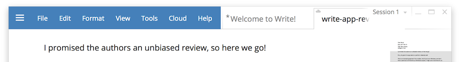
Non-native UI
First, Write’s UI looks and behaves like a Windows app. It’s built on Qt, which does support native(-looking) widgets, but the developers chose not to use them – I assume in the interest of speed of development. If you’re on Windows, that’s fine. But this app will never look remotely native on macOS,4 and given the plethora of other really high quality writing apps on macOS—some of them with their own publication options!—there’s just no reason why you would pick this over one of those at that most basic level.
Two examples should illustrate how painfully non-native this app is visually. First, note the window action buttons in the upper right:
These are Windows window action buttons; the normal Mac action buttons simply don’t exist! Similarly, there’s a slide-out menu that appears when you tap the hamburger in the top left:
This is a reasonably nice, though not totally native-feeling, way of tackling the menu problem… on Windows. On Mac, it’s just duplicating the functionality of the normal menubar. And when I say duplicating, I mean it exactly: those menus are the same as the ones the app puts in the real menubar; there’s no reason for them to appear within the body of the app, other than that the app isn’t designed to work without them.
Right-click behavior is strange: instead of the normal Mac (or even Windows!) menu, they’ve supplied their own, and it’s actually its own little modal window, not a menu at all:

I definitely see the utility of the little modal, but most other apps I’ve seen with similar approaches do it on highlighting some text. That way they can leave the normal right-click menu in place, which helps keep the user comfortable in their normal workflows. That’s going to be particularly annoying if you happen to make heavy use of macOS’s services menu—I don’t use it often, but when I want it, I want it.
Keyboard shortcuts
Similarly, a number of standard keyboard shortcuts don’t work the same way, or don’t work at all, in Write! as they do in native Mac apps. Navigation controls aren’t quite right: ⌥→ jumps to the start of the next word instead of the end of the current word; ⌥← doesn’t skip over punctuation; both stop on e.g. apostrophes in Write! (they skip over them natively). Other common shortcuts are bound to the wrong things: Shift⌥-, for example, increases heading size instead of inserting an em dash. ⌘Delete doesn’t do anything; neither do ^⌘Space, (normally used for bringing up the special-character selector) or my beloved ^K (“kill to end of line”) or ^T ("transpose characters around cursor) combos.5 I imagine the list is longer; that’s just what I noticed in the course of writing this review!
Most egregiously, Write! steals the keyboard shortcut ⌘`, normally used to switch between windows on macOS, to focus itself. Failing to implement and indeed overriding text input commands is one (very bad) thing; this is another kind of failure entirely. Apps should never override core system behavior with their shortcuts! The fact that you can customize them doesn’t make this better; and the one time I tried to customize it (to turn off stealing the switch-window shortcut) it ended up overriding the A key’s behavior to create new documents instead of to, well, enter the letter “a”.
A lot of apps get some of those more obscure ones wrong, sadly, but proper use of Core Text is a must for a native app in my book—and missing those super common ones is a big no-no. I simply won’t use an app long term that doesn’t do that, because I find the mismatch between the rest of the OS (and my muscle memory!) and what the apps do too frustrating.
Markdown support
The app claims Markdown support, and it sort of has it. But the goal is clearly to have a rich-text editing experience which can translate Markdown into whatever the underlying format is on the fly, and then export it back out when desired—not to be a Markdown writing application. You can see direct evidence that this is their approach by writing in Markdown and e.g. creating italics with * characters. When you view the exported Markdown, it’ll be using _ characters instead. Other little things flag it up equally: Markdown items don’t get converted to their rich text implementations unless you add a space or some punctuation after typing them; if you go back and wrap words in link syntax, for example, or try to make it bold with a pair of *s, it won’t be converted at all. The export still works fine in that case,6 but it certainly doesn’t come off well for the writing experience in the app, inconsistent as it is.
It also doesn’t support Markdown itself fully or properly. Inline backtick characters (`) don’t generate inline code snippets. Instead, they generate standalone code blocks, as if using the usual four-space-indent or triple-backtick markers for code blocks in the actual Markdown spec and as supported in other apps. Nor can I find a way to insert hrules/divisions with triple-stars or triple-dashes.
Other nits
There are a few other small but significant problems as well. One is related to the business model: you actually have to sign in to start using the app. Granted all my positive comments about subscriptions above, it’s still the case that needing to sign in to a writing app (especially just to use the app for local documents!) is a non-starter for me. As with so many of the other negatives I noted, this is a compromise that I don’t need to make, because the other alternatives don’t force it on me.
There are also a bunch of basically rough edges. Pasting with ⌘V does indeed paste the text… and scrolls you to the top of the current document every time. A number of times, the selection of a given option failed: it simply wouldn’t stick. Other times, especially when selecting the default text theme, cursor selection seemed broken. I’m not sure whether those are problems with the Qt engine, the implementation, or some of both, but again: not a good look, especially in a crowded market. Right-clicking, beyond the problems mentioned above, also just wouldn’t work consistently. Sometimes I would right-click and the menu would close immediately so you couldn’t take any actions in it at all—probably a result of using a modal instead of a normal menu there. Regardless of the reason, it was frustrating.
Last but not least, the app is unsigned, which means that it literally won’t open by default on macOS as of a few versions back. Users can certainly get around that, but they shouldn’t have to: there’s no excuse for not signing a paid app for macOS (or Windows! But I’m not sure what its status is there) in 2017.
Conclusion
This is an interesting approach for an editor. Trying to build a truly cross-platform app, and especially one that isn’t using web technologies like Electron, is an admirable goal—in fact, it’s one that I may dare to tackle myself at some point. Cross-platform UI is also a very hard problem, and unfortunately this app makes clear just how difficult it is by falling down so often on really important details. In reality, the only way to do it well is to write all your core business logic in a way you can share and then supply actually-native user interfaces. Anything else will inevitably feel out of place at best.
As a result, Write! is deeply compromised as a Mac app, to the extent that I simply cannot recommend it for Mac users. If you’re on a Mac, you should look instead at Ulysses, Byword, and Caret. All of them feel much more native, and though they have different strengths and weaknesses, they’re all native (or mostly-very-effectively native-acting, in Caret’s case) apps. That doesn’t mean Write! is bad; it just means it’s not worth your time (a) if you’re on a Mac or (b) if you really care about standard Markdown behaviors.
As noted, though, the developers got some important parts of this very right: the app performs well, it looks decent on Windows, and their sync engine seems incredibly solid. Accordingly, if you’re on Windows, and don’t already have a particular commitment to Markdown proper, I might even cautiously recommend it—as a replacement for something like the old LiveWriter app, for example. The biggest hesitation I’d have there is the business model—and, as noted above, I’m not opposed in principle to subscription models for good apps; but I’m not really sure what the value proposition here is.
Yes, the app is named “Write!” – not “Write”. It’s not my favorite, not least because it means you have to type an exclamation point every time you write (!) it.↩
There are many reasons for that, including things to do with many Linux users’ antipathy toward paid or non-open software, which makes it very difficult for not only developers but especially designers to make a living. Never mind the incredibly small size of the audience by comparison.↩
And who knows if Medium will still be around in five years? But that’s for another post another time.↩
Or Linux, but then what exactly is native on Linux anyway? 😏 More seriously, this will look out of place on any Linux desktop environment.↩
These latter ones are sadly too often the case for cross-platform tech; I’ve filed issues on VS Code and Atom in the past that way.↩
I’ll actually give Write! one point over Ulysses here: Ulysses does some similar conversions under the hood to make the writing experience seem snazzier, and things which don’t get turned into their custom “text objects” can end up exported very strangely.↩